GVV x The Dopest x RONIN
The Dopest x RONIN: A Premium Packaging Collaboration
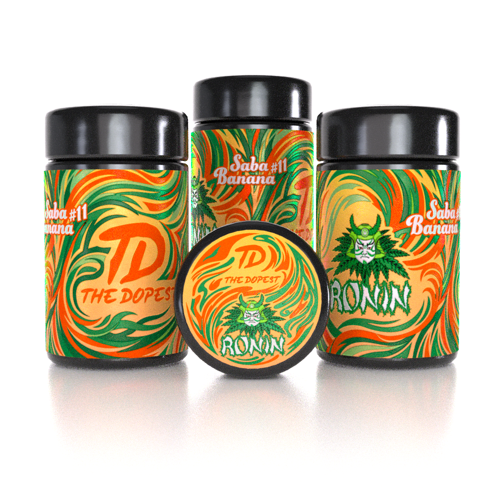
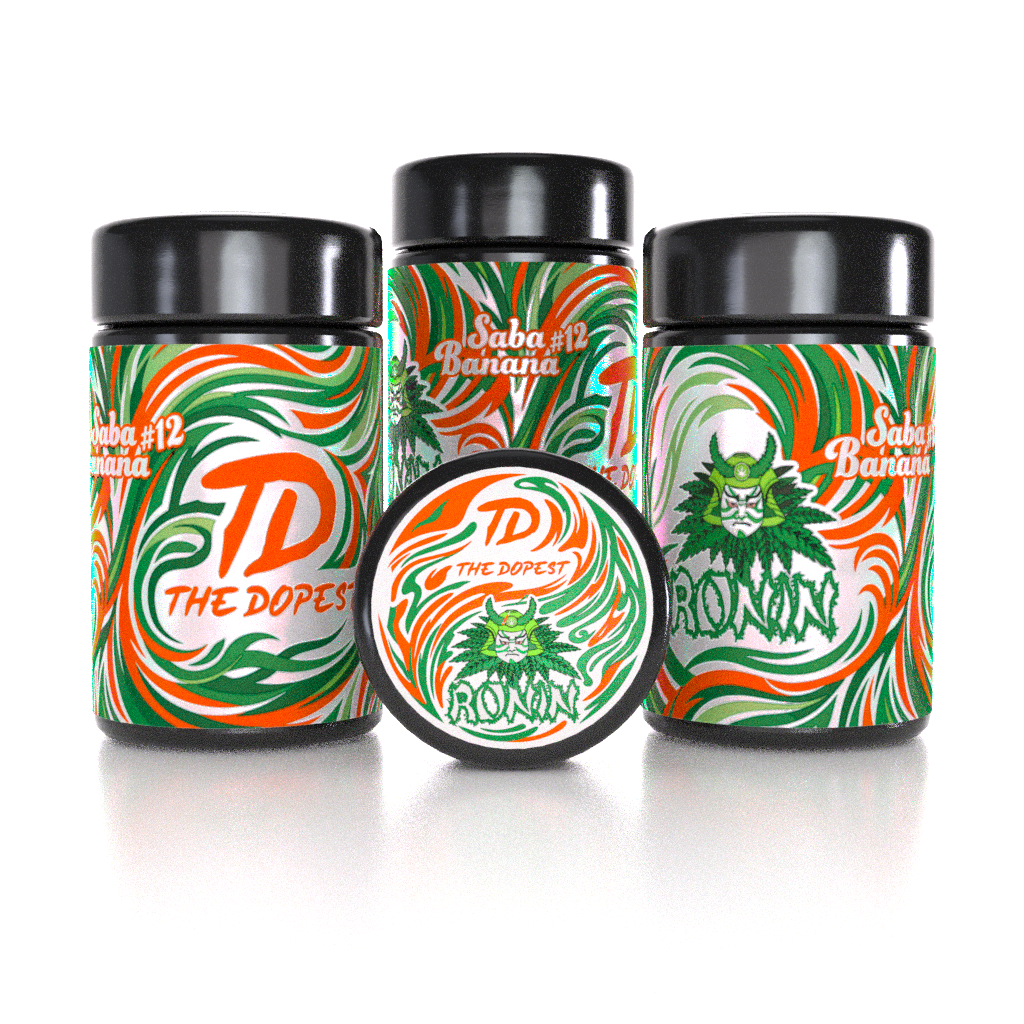
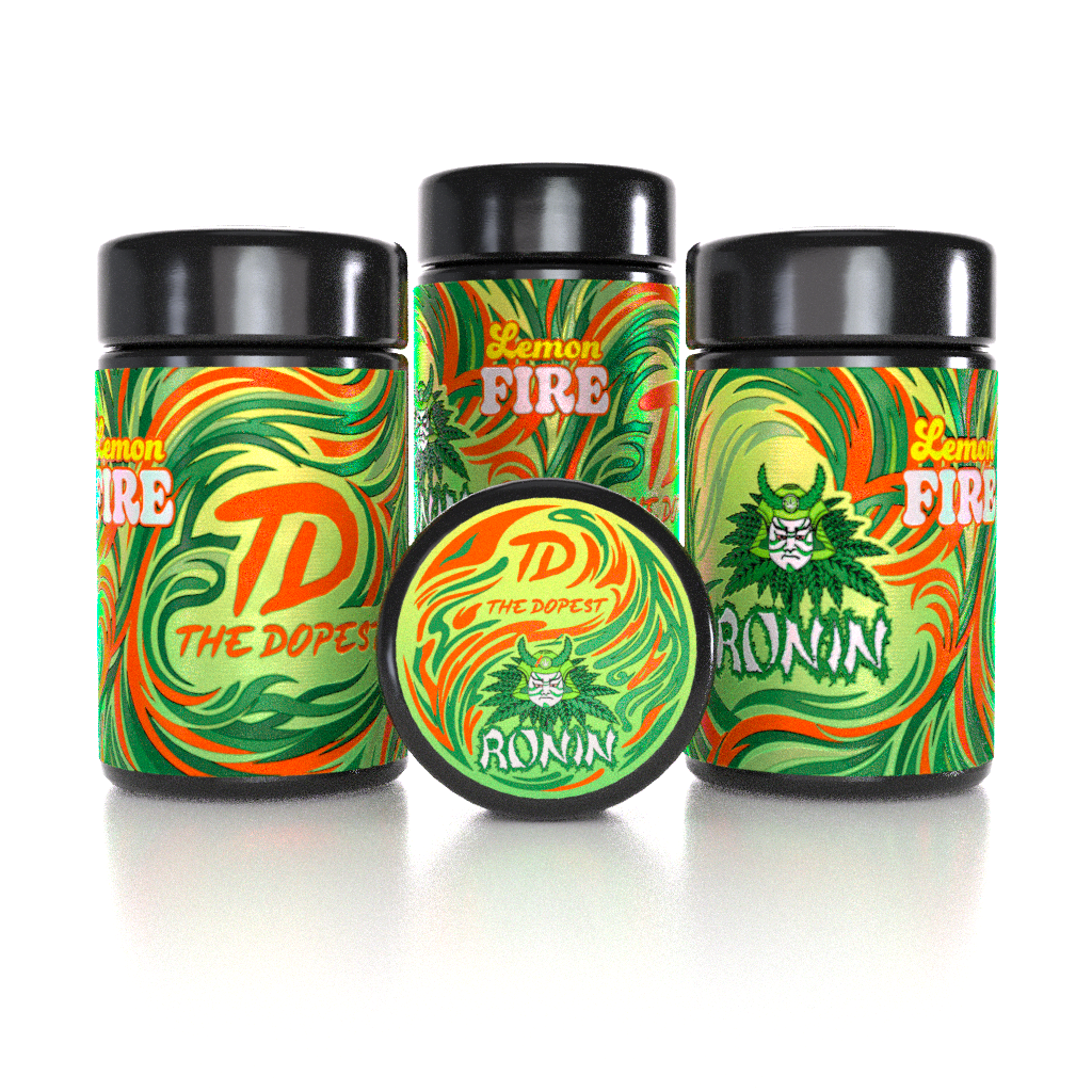
Earlier this year, we had the opportunity to work on a packaging and visual design project for The Dopest x RONIN, creating a collection of three complementary MIRON jar designs for Saba Banana #11, Saba Banana #12, and Lemon FIRE THCA.
Now available through The Dopest Shop, the collection gave us the opportunity to bring two distinct brand identities together while maintaining the premium, recognizable aesthetic already established across The Dopest Shop product line.
Three Strains. One Cohesive Collection.
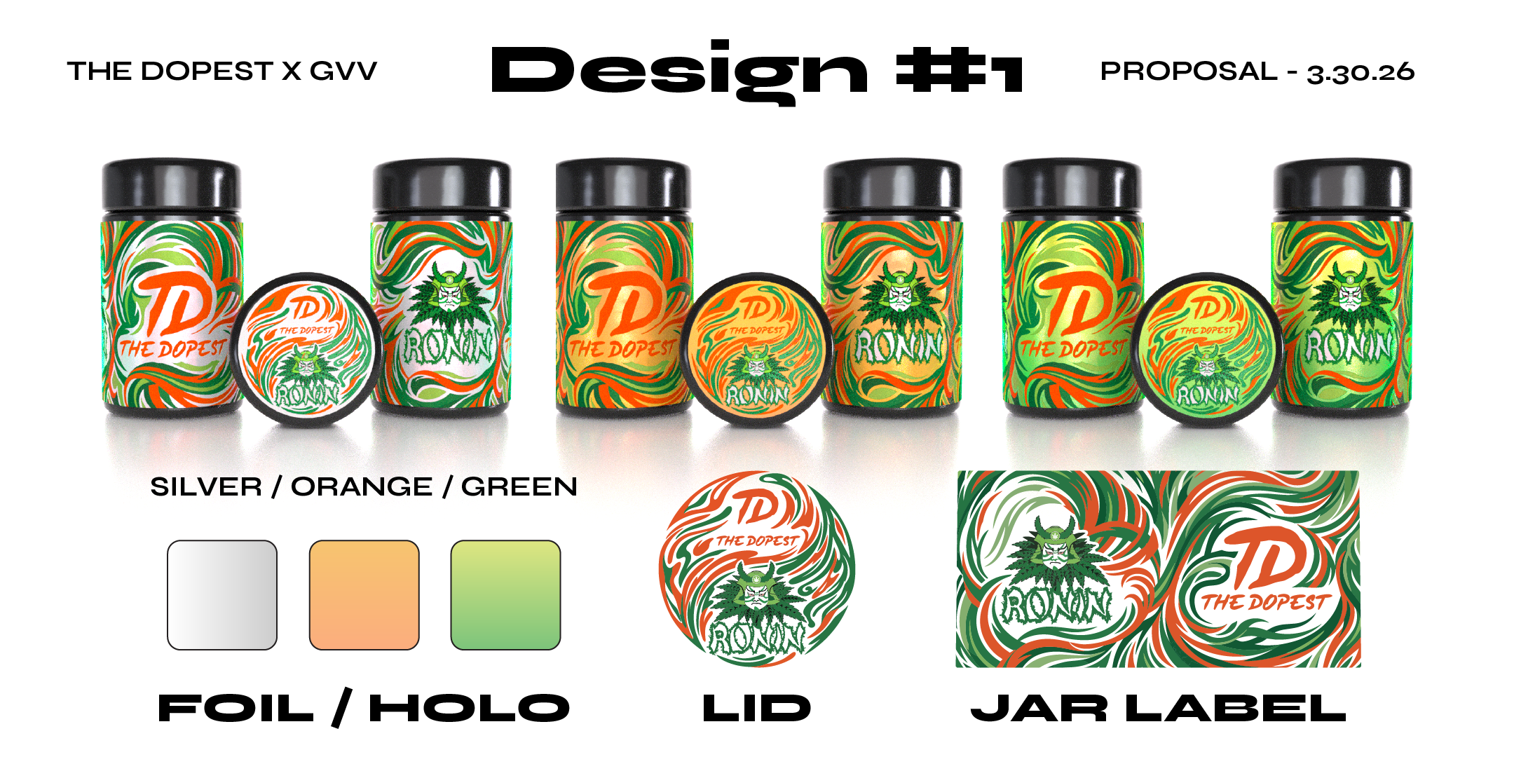
The goal was to create three individual jar designs that could stand confidently on their own while still feeling like part of the same collection.
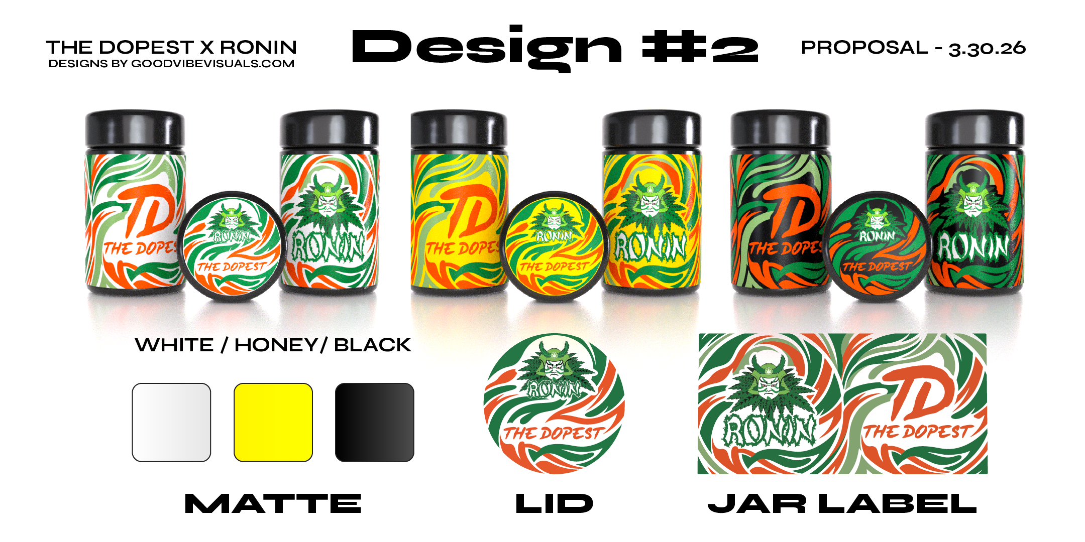
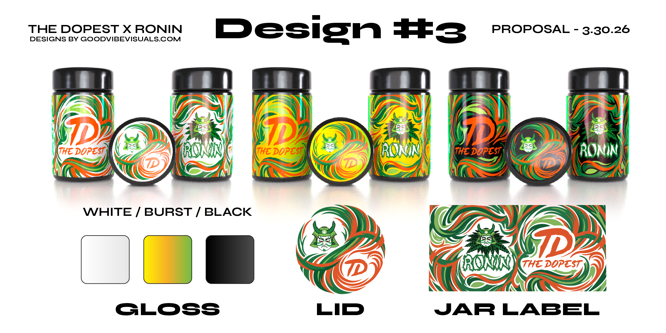
We began by developing three different design directions, working directly with the clients' existing logos, selected color palette, and visual references. A major part of the design process was creating and integrating a custom vectorized pattern that added visual flair to the packaging while helping communicate the collaboration between The Dopest and RONIN.
The pattern became an important visual element throughout the collection, giving the jars additional depth and personality without overpowering the core branding.
At the same time, we wanted the designs to feel at home alongside the other products already available through The Dopest Shop. Rather than creating something completely disconnected from the existing product ecosystem, we focused on developing a visual language that felt fresh, premium, and collaborative while still fitting naturally within the brand's established style.
Exploring the Logo Finish
To push the packaging concepts further, we explored three different logo treatments:
-
Matte
-
Gloss
-
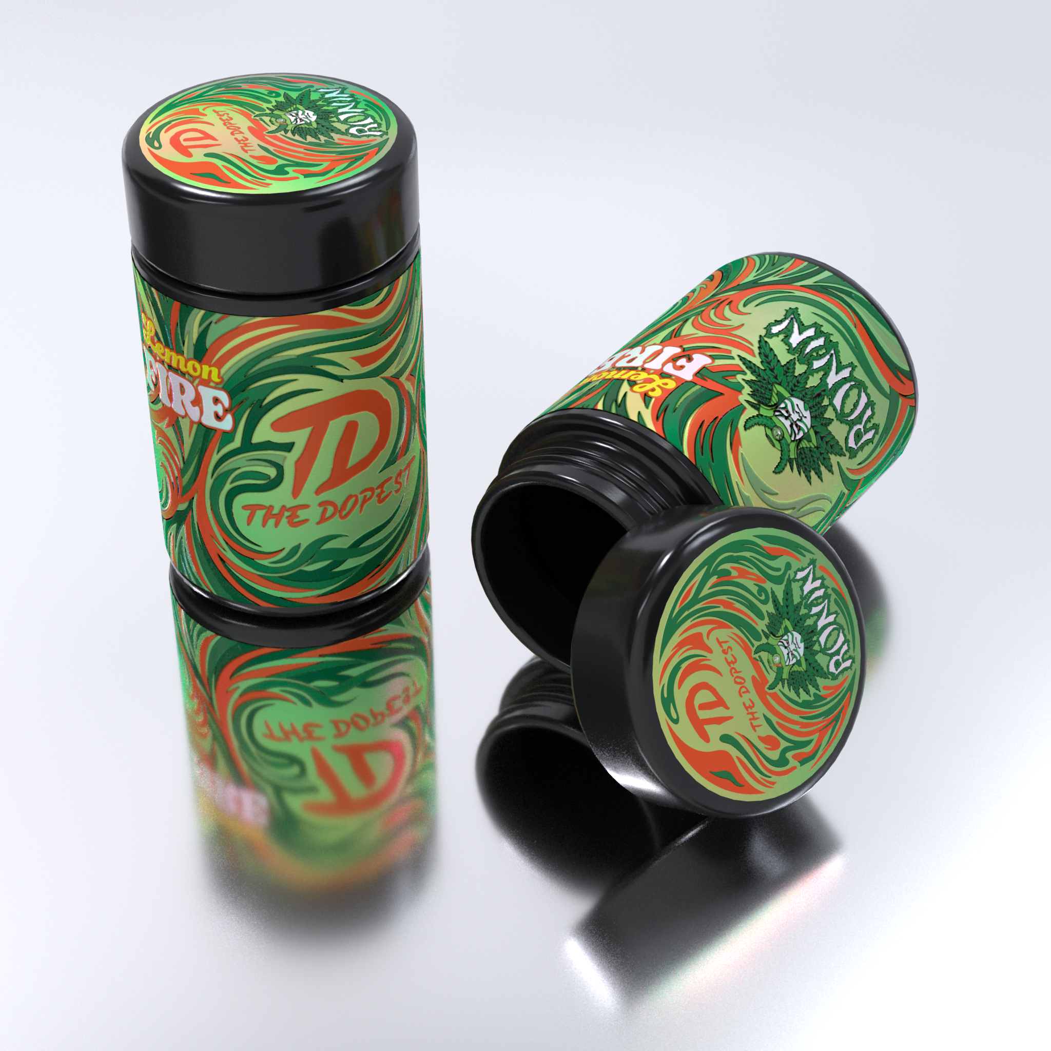
Foil Holographic
Each finish created a noticeably different visual experience, particularly when translated into the 3D environment. The variations allowed the client to compare how the branding could interact with light, reflections, and the physical material of the MIRON jars.
Once the client selected the direction they liked most, we moved into the next phase of the project: 3D texturing and visualization.
Bringing the Packaging Into 3D
After the final design direction was approved, we recreated the packaging in 3D and began developing realistic materials, textures, lighting, reflections, and surface details.
This allowed us to take the approved flat artwork and turn it into photorealistic product imagery that could be used for online product photography and marketing.
As part of the project, we provided the client with complimentary 3D-rendered product images to help showcase the finished jars online, along with several vertical story-format visuals designed specifically for social media.
We also created a short 10-second animation, giving the packaging an additional dynamic format for digital marketing and social content.
From Design Concept to Finished Product
One of our favorite parts of projects like this is seeing how a concept evolves from a flat design into something that feels like a physical product.
The process moved through several stages:
Brand Assets → Design Concepts → Pattern Development → Logo Finish Exploration → Client Selection → 3D Texturing → Product Rendering → Social Content → Animation
Each stage gave us another opportunity to refine the visual identity and make sure the final product felt cohesive across both still imagery and motion.
The Final Result
We really enjoyed working on this collaboration and bringing the The Dopest x RONIN collection to life.
From the initial packaging concepts to the final 3D renders and animation, the project was a great example of how thoughtful graphic design and 3D visualization can work together to create a complete product identity.
We're excited to finally share the results with you — and even more excited to see the finished collection available through The Dopest Shop.
Saba Banana #11. Saba Banana #12. Lemon FIRE THCA.
Three strains, three designs, one cohesive collaboration.
Thank you to the team at The Dopest x RONIN for trusting us with the project. We had a great time bringing this one to life. 🚀